
The ideal machine has one on/off switch
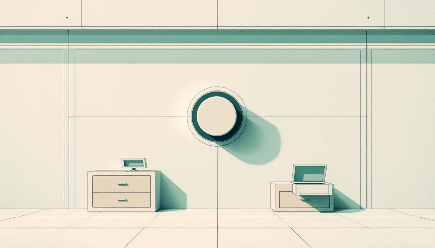
All my life I have liked software best that offers few options.
The best counterexample I know is Photoshop. It overwhelmed me every single time. That says more about me than about Photoshop, and I am not going to turn it into a review. But the feeling is the point: you open a thing, see two hundred buttons, and some quiet part of you decides that this will be work.
I now build software for other people, and that feeling is the first thing I want to take away from them.
The expectation people bring with them
When someone arrives at one of my products, they arrive with a guess about what is ahead. Think of website builders from years back. You think of a huge task. Hours, decisions, a manual, probably a mistake you will not find until later. That expectation is not stupid. It has history.
So the real competitor of a first screen is not another product. It is that guess. If the first ten seconds confirm it, people leave before they have done anything. If the first ten seconds contradict it, they stay, and they stay because it felt light, not because they fought their way through.
What I want in those ten seconds is mostly one thing: the fear has to go. People need to feel that nothing happens without them and that everything can be undone.
One switch
My north star is a sentence I said out loud while talking this through: the ideal machine has only one on/off switch.
A hair dryer has exactly that: one switch, and nobody misses anything, because it only has one job. Software has many more jobs, so it will never be quite that simple. For me the hair dryer is a direction, not a spec, and every redesign should end one step closer to it than it started. Which also tells me how to proceed: gently, not radically. I do not remove features. I move weight.
The art, as I see it, is to offer the person, nearly always, what they need most in this moment. The other options have to exist. They just do not all need to be on the screen.
Five choices, one of them already picked
Alternatives are good. People like to choose. The problem starts when the number grows.
The research is reasonably consistent here, and I would rather cite it than my taste. Working memory holds around four units (Cowan, 2001); the famous “seven plus or minus two” from 1956 is considered too high today. A meta-analysis by Chernev, Böckenholt and Goodman (2015) found that choice overload mostly shows up when the options are complex, when you do not yet know what you prefer, and when nothing recommends one of them. That is a very exact description of a newcomer. And each extra option makes the decision take longer (Hick’s law).
So my rule is three to five choices, one of them marked as the recommendation and already selected, so a person who does not think about it still lands in the right place. The preselection matters more to me than the exact number. Everything beyond the five sits behind “More”.
Say instead of search
One thing is new compared to the software I grew up with: you can build an AI into the product that works out much faster what a user wants and is looking for. For someone who knows what they want, “tell the chat” beats “find the menu”. The chat does it.
There is a limit I hold myself to: a function may live only in the chat if the chat can really carry it out. Anything else stays reachable by hand.
What it looks like in two of my products
Two small changes from 19 October 2026, so no big claims.
In palimpalem I removed the editor tour without replacement. In its place there is now a card, “Siguiente paso”, with exactly one suggestion.
In mindbeamer I rebuilt the start page. There used to be an orange box saying publishing was locked. Now there is a calm “Next step”. The explanation boxes are gone. On the phone there are three tabs and a “More”. In mindbeamer the “on switch” is, in fact, an approval email, and the app should be something you barely have to open.
None of this is measured yet. The honest test is the share of people who reach their first real result, before and after, and I do not have that number. Until I do, this is a belief with a good reading list behind it.
The question I ask of every element
Does the person need this right now? If not, it goes one level deeper, or into the chat.
I ask it about buttons, about boxes, about tours, about warnings.
If you build anything with a first screen, try it on yours: take the most-used page, point at each element, and ask whether the person needs it right now. I am curious how much is left standing.
Get new posts by email
One mail when a new post is out. Nothing else: no drip campaign, no tracking, no “quick question” follow-ups. Unsubscribe with one click, any time.
Double opt in: you get a confirmation mail first. Your address is used only to send these posts. Controller: Martin Schenk S.L. · Privacy